Loading the stage…
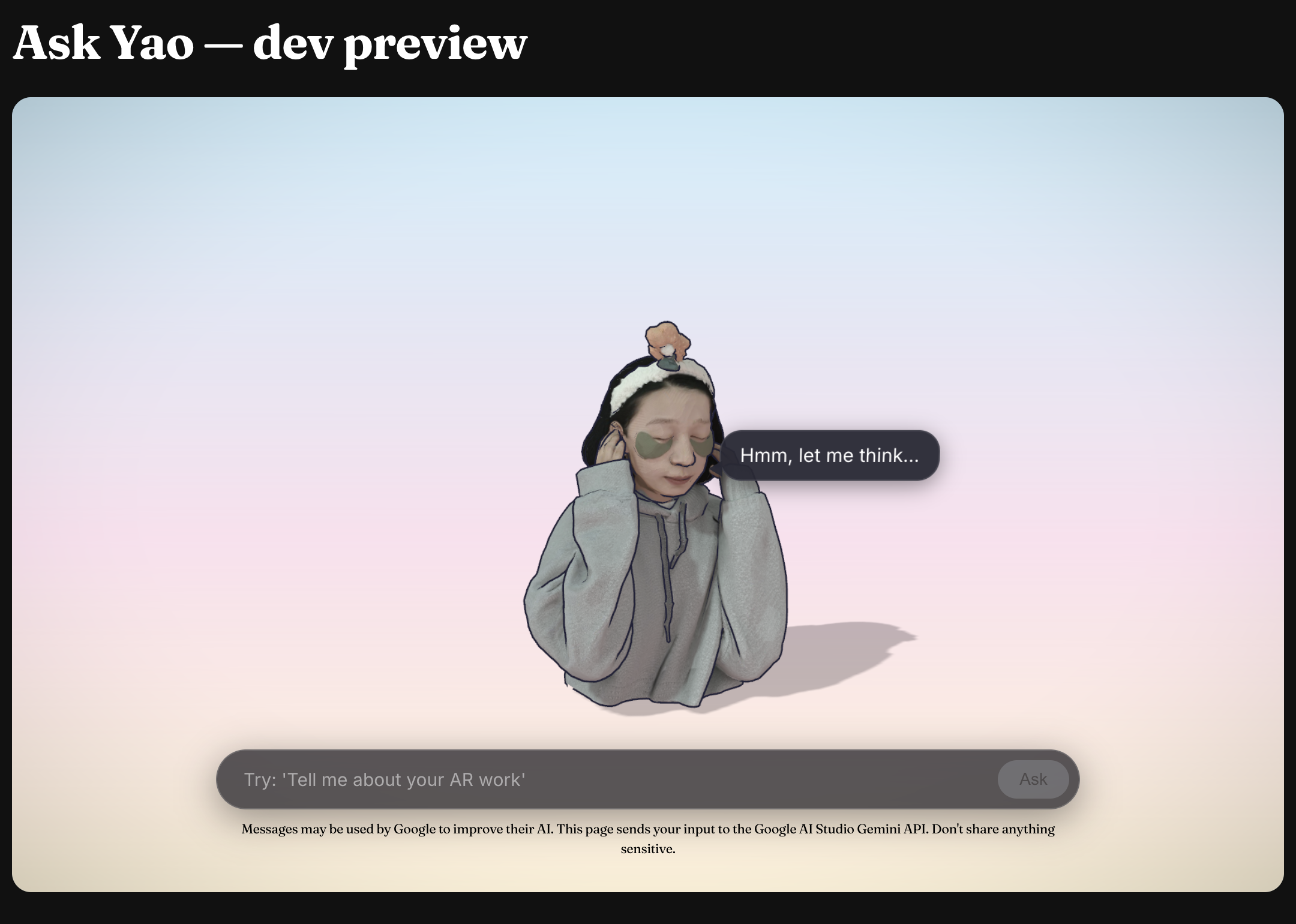
A 3D chatbot of myself answering portfolio questions — project cards float in whenever the model needs to point at specific work.
Visitors land on a portfolio and don't know where to start. They might want a specific project, my background, or just to poke around — and a static gallery makes them dig. Generic chatbots don't help: they don't actually know my work.
So the chat itself becomes the project. A 3D scene where I'm answering questions from inside the page, with project cards floating into view whenever the model needs to point at something specific. Asking "show me your AR work" returns clickable cards, not paragraphs — the chat doubles as a navigation surface.
Audience: visitors scanning for AR/MR or design engineer work, designers reading process, friends being curious. The design choices below try to land the visitor case without burying the process detail, and to keep the playful side intact for the curious.
Design exploration
The whole design lives in a brainstorming transcript with Claude Code's superpowers:brainstorming skill — one question at a time, with a visual companion that opens HTML mockups in the browser as the conversation evolves.
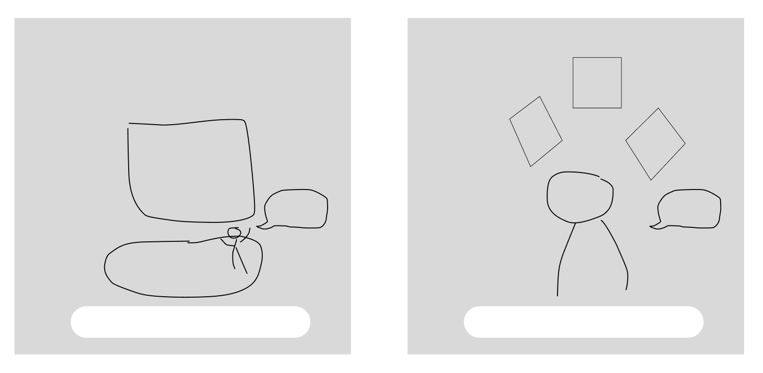
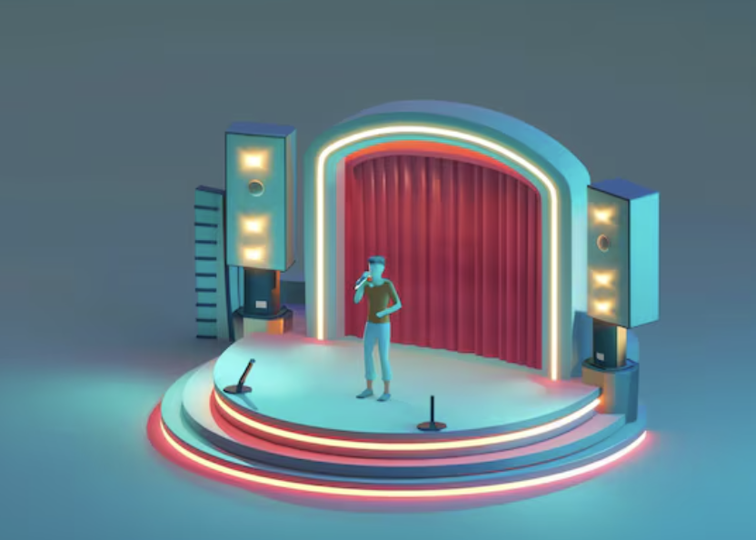
Two layout sketches I drew first — a stage + screen composition (left), and a head and shoulders bust with project cards floating in a fan above (right):
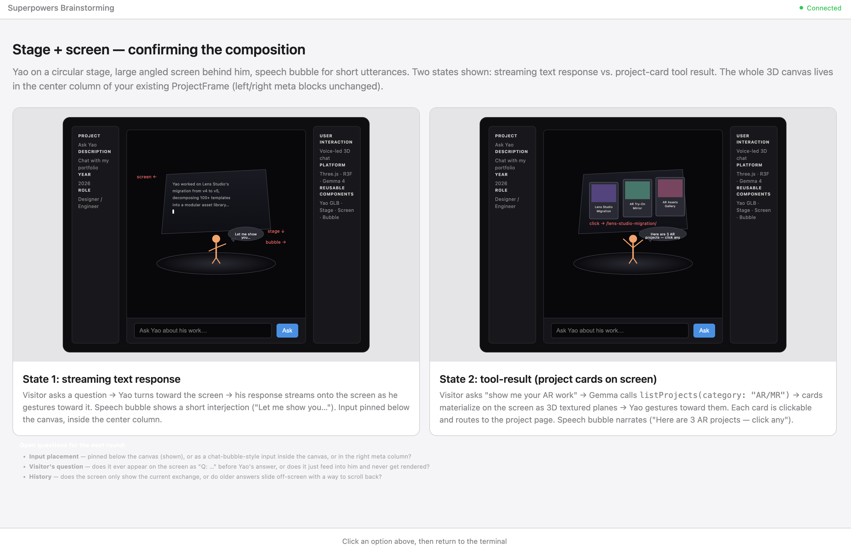
The brainstorm worked through the stage version in browser mockups. Streaming text on the left, project card tool results on the right, no chat history accumulating between turns:
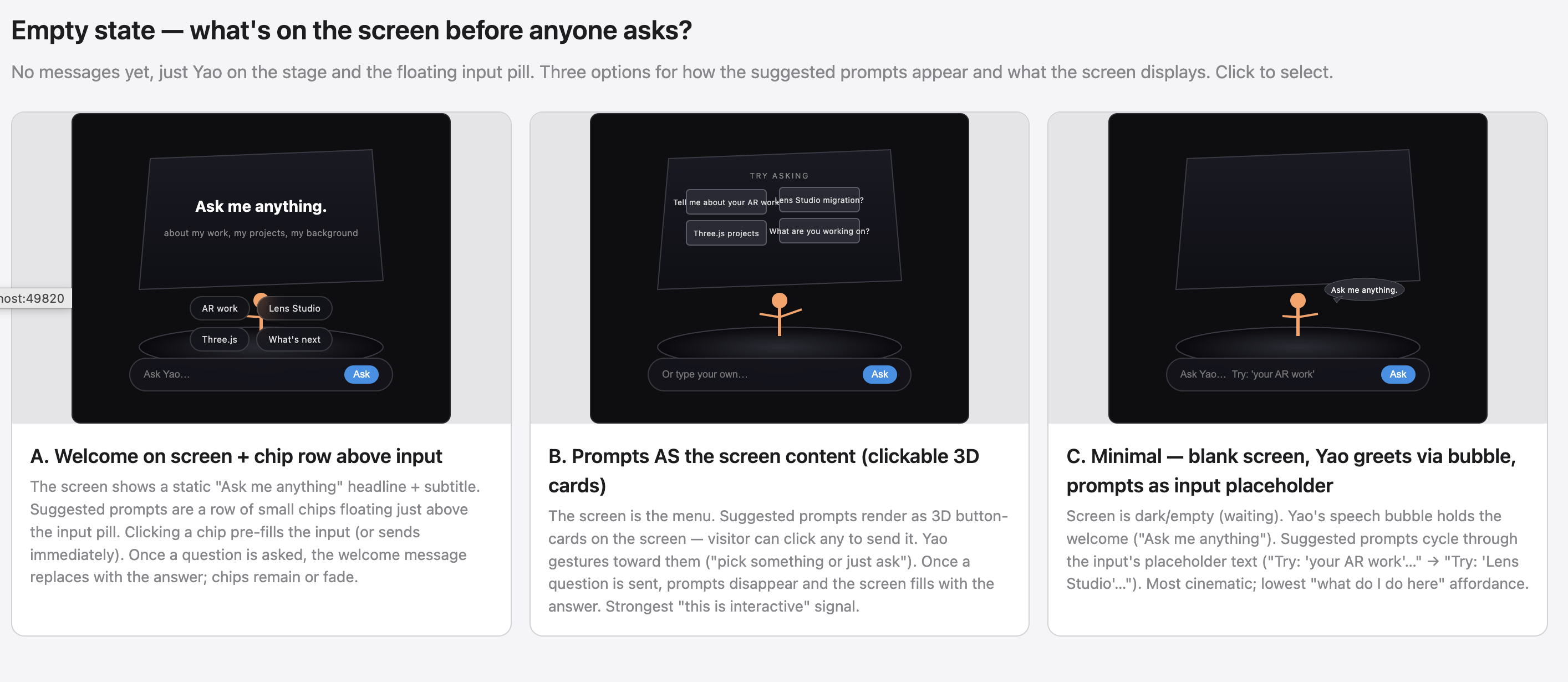
Then the empty state — what's on screen before anyone asks. Three options. I picked C (minimal blank, prompts cycling in the input placeholder) for the most cinematic read:
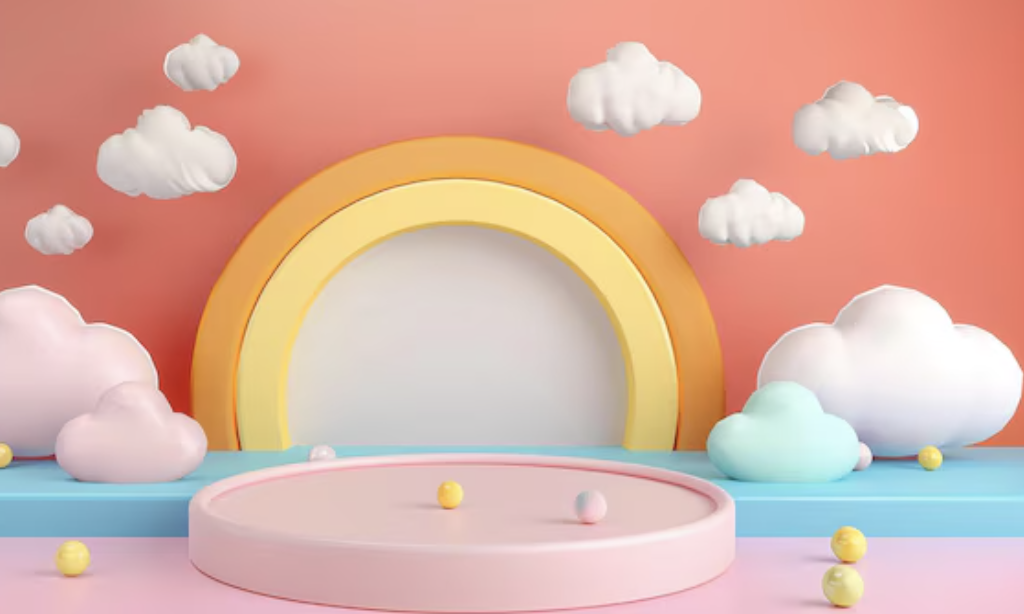
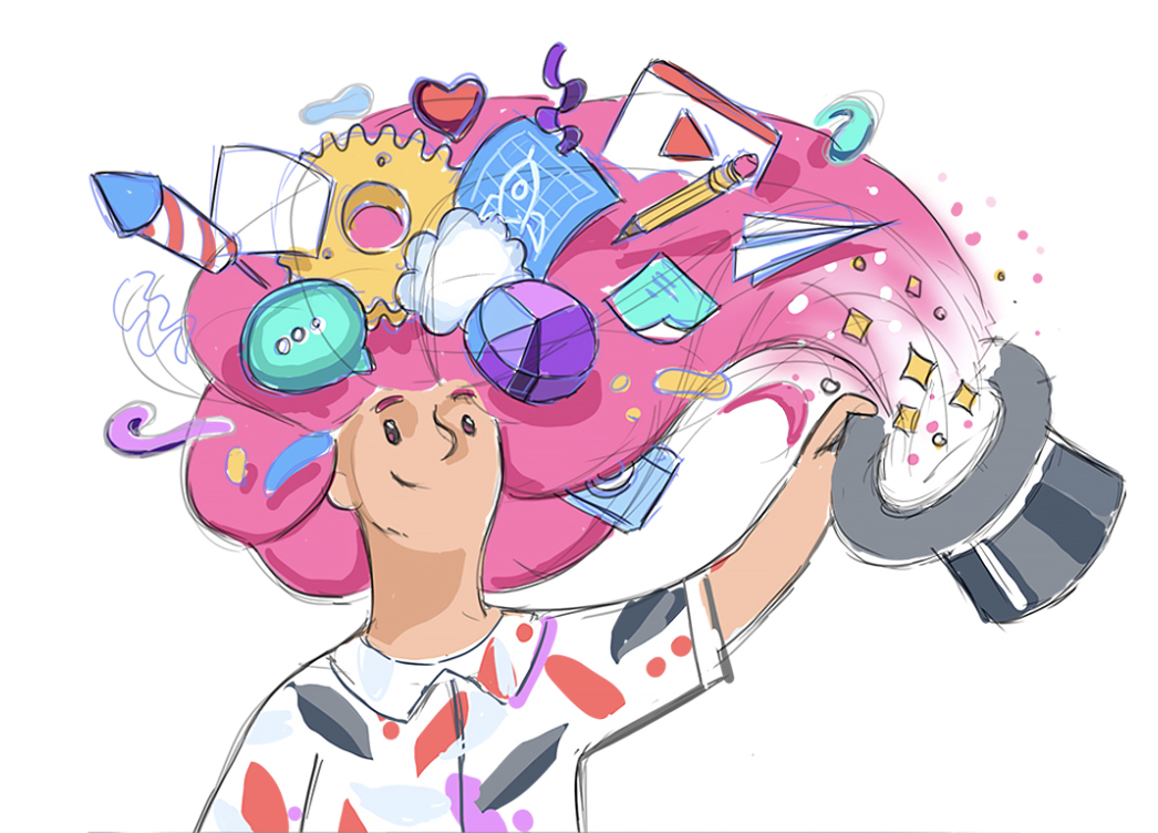
Visual references locked the look — pastel podium for the color palette, theatrical stage for neon rim treatment, illustration with stuff flowing from the head for the project cards as thoughts pattern, 3D chat bubble vignette for the chat as 3D object framing:

Visual iteration
The bust's style is determined upstream by whatever reference image feeds the image-to-3D pipeline — picking the right reference matters more than tuning the 3D model afterward, because each tool's stylistic bias propagates straight through.
I cross-tested several AI image generators on the same brief (cartoon-illustration head and shoulders, friendly designer aesthetic):


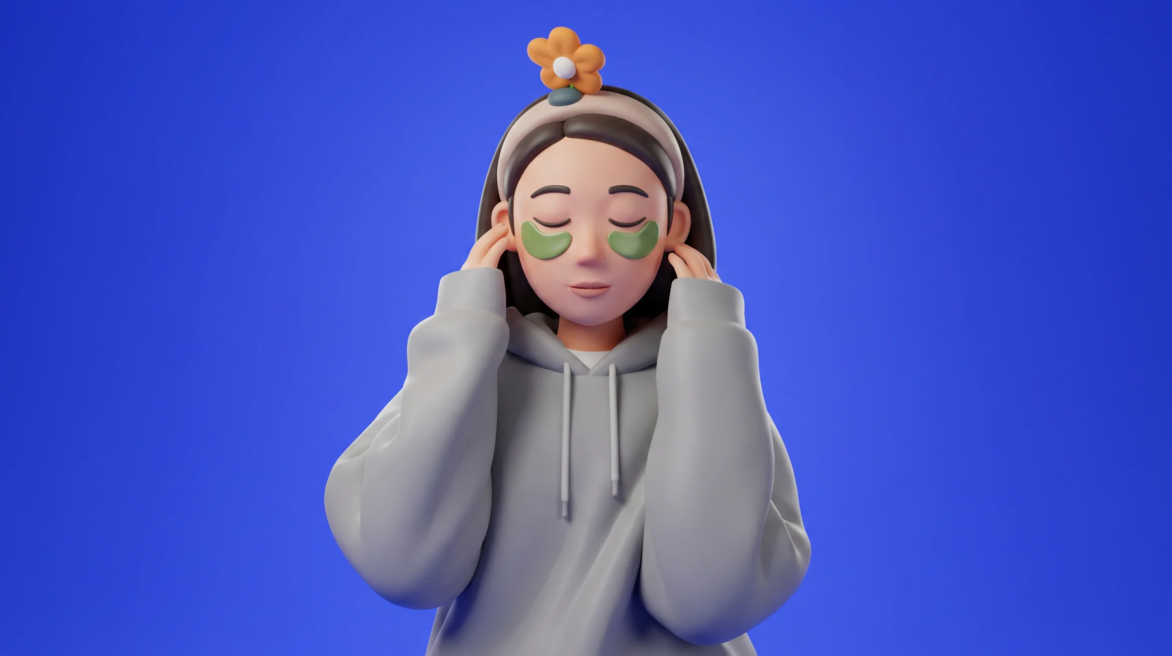

Midjourney leaned painterly. Gemini's Nano Banana 2 leaned cleaner cell-shaded. ChatGPT leaned the most photoreal. The Nano Banana 2 result was the closest to the toon-shaded card aesthetic I'd already locked for the project cards, so its output became the reference for the 3D step that follows.
Image-gen tools are stylistically opinionated even when the prompt is identical. The choice of upstream tool is a design decision, not a tooling decision — Midjourney's bust would have shifted the whole chat's vibe toward painterly illustration; ChatGPT's would have nudged it toward semi-realistic. Picking Nano Banana 2 was about coherence with the rest of the page, not "which one looks best."
Prototyping
Built the stage version first. Fullbody Yao on a tiered neon rim stage, presenting a curved screen behind her:
It worked, but felt wrong. The fullbody figure was so small at any sane camera distance that you couldn't read her face — and a chat is mostly about reading the face of the person talking. The neon rim and curtained stage were doing a lot of theatrical lifting for an interaction that's actually quiet (a one-line question, a one-paragraph answer).
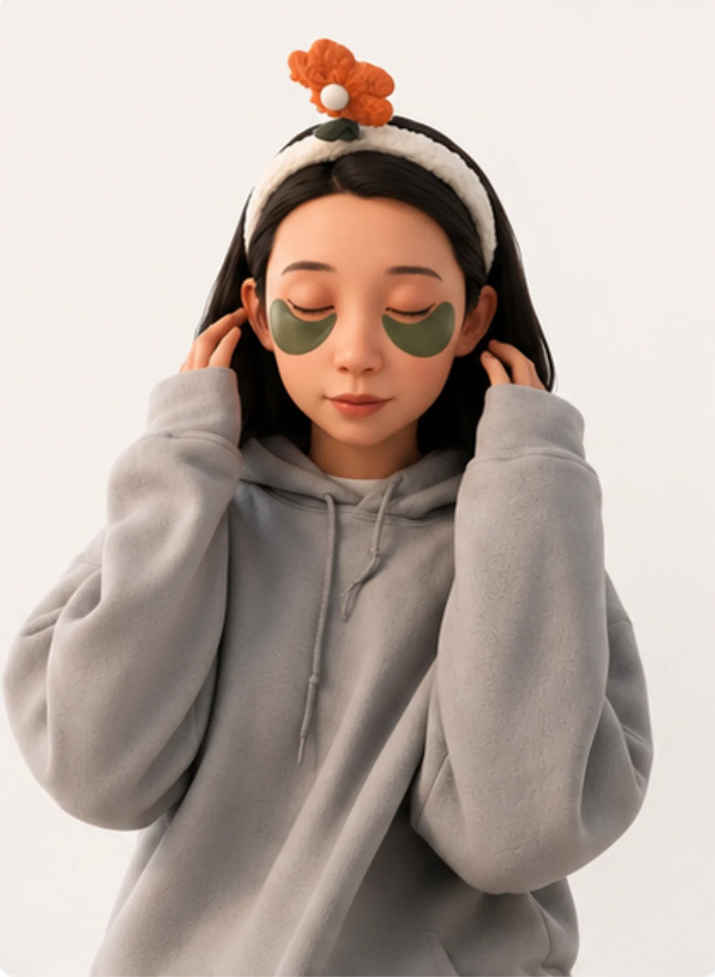
So I tried the second sketch — closer camera, head and shoulders bust at conversational distance instead of full body across a stage. Fed the chosen reference (Nano Banana 2, see Visual iteration above) into ComfyUI's image-to-3D pipeline, then exported to Blender for cleanup — texture paint for the cartoon-illustration look that matches the cards, plus a topology pass so the rig stays clean.
I generated multiple bust variants from different references during this step. Try the picker chips at the top-left of the chat above to swap between them live — drei's GLB cache keys by URL so all three stay warm after first load and the swap is instant.
Everything else collapsed into place from there. Pastel sunrise gradient instead of the dark neon stage. Toon-shaded materials with cell-banded lighting and a chunky inverted-hull outline so the bust reads against the colorful backdrop. Project cards animate out from the bust's position when a tool result arrives — they look like thoughts being pulled out of her head. Status-driven pose modulation (lean in on loading, sway on streaming, slump on rate-limit) so the bust isn't just sitting there.
Responsive states
Each state has a deliberate UI mapping so the visitor always knows what's happening:
| State (trigger) | Input | What Yao + the scene do |
|---|---|---|
empty (page load) | enabled, placeholder cycles | gentle bob, greeting in the bubble |
loading (user submits) | disabled | leans forward, faster bob; "Hmm, let me think…" in the bubble |
streaming (first token arrives) | disabled | head sways; bubble fades; text or cards animate out from the bust |
ready (response complete) | re-enabled | back to idle |
error (upstream throws) | enabled | mild downward tilt; error message in the bubble |
rate_limited (API returns 429) | disabled until timer | slumps down, animation slows; live countdown in the bubble; scene dims |
refused (safety/moderation block) | enabled | mild tilt; polite refusal in the bubble |
A few decisions worth calling out:
- Disable input during loading/streaming. Prevents the visitor from queuing a new question over an in flight one — two answers stomping each other on the screen would be confusing. The "Ask" button greys to 20% opacity so the disabled state is unmistakable, not just unresponsive.
- Status lives on the bust, not just in the input. Pose modulation (lean in on
loading, sway onstreaming, slump onrate_limited) communicates system state through the character. Amplitudes are deliberately small — reads as personality, not loading spinner desperation. - Cards animate out from where Yao is standing. They look like thoughts being pulled out of her head. Without that motion they'd just appear, feeling disconnected from the speaker.
- Rate limit countdown ticks every second. The bubble updates live ("back in 4 min 32 sec"). The visitor sees the timer move, knows the system isn't broken, knows when to come back.
- Failed states never trap the user.
errorandrefusedkeep the input enabled — visitor can immediately retry or ask something else. Onlyloading/streaming/rate_limitedactually lock interaction. - Status transitions are tweened, not snapped. Pose changes lerp at ~250ms half life. Phase integrated bob/sway means switching states never produces a visual jump even mid cycle.
Under the hood
Pipeline
Browser POSTs to /api/chat (a Vercel Function). The function calls Google AI Studio's Gemini 2.5 Flash-Lite via the Vercel AI SDK. When the model decides to call a tool, the function runs it locally against my own portfolio data and feeds the result back to the model — the request can loop tools↔model up to twice before the final answer streams back to the browser as Server-Sent Events. The 3D scene watches the event stream and updates accordingly.
System prompt
You are Yao, a designer engineer answering portfolio visitors in first person —
direct, specific, slightly dry, occasionally self deprecating. Don't oversell.
Talk like a thoughtful colleague.

For project questions, ALWAYS use a tool — don't invent project names or facts.
For background / approach / philosophy questions, answer directly from the
"About Yao" facts below; only call an about tool when the visitor wants depth
beyond what's there. (...)
The prompt does voice + ground rules + the load bearing "About Yao" facts that get asked the most often (bio, education, design+tech grounding, AI tooling thesis). Keeping those facts inline means most identity questions resolve without any tool call — saving a round trip's worth of latency.
Tools
Project lookup (run time data) and about Yao depth (when the system prompt facts aren't enough), all pure functions running against existing portfolio data:
| Tool | Purpose |
|---|---|
listProjects(category?) | List my projects, optionally filtered to AR/MR / WEB / INSTALLATION / SELECTEDWORK. |
getProject(slug) | Full detail for one project — role, collaborator, year, platform, etc. |
searchProjects(query) | Substring search, top 5. |
getBio / getSnapShipped / getSnapMCP / getPreviousWork / getAIPractice / getRecognition | Topic split bio depth. The model picks the smallest one. |
When a tool returns project summaries, the chat scene renders them as clickable 3D cards floating around me — not text. They animate out from where I'm standing, and click-through opens the project page in a new tab so the chat survives the navigation.
What I learned
The build surfaced a few things that didn't fit my original mental model:
- First token latency mattered way more than I expected. I tuned token throughput first, then realized nobody actually notices that — what they notice is the gap between hitting Send and seeing the first character. Cut that from ~6s to ~1.5s by trimming the about context bundle (5k input → ~1k), splitting one mega
getAbouttool into 6 focused slices, then inlining the most asked facts into the system prompt so identity questions answer with zero tool calls. CappedMAX_TOOL_ITERATIONSat 2 so the model can't chain three tools "to be thorough" before answering. - The chat ended up working as a navigation surface. I designed it to answer questions, but in testing I kept catching myself using it to find projects ("show me your AR work" → cards → click). The clickable 3D cards pattern turned out to carry more weight than the conversational answers.
- Cartoon style fixed the "AI uncanny" problem. First prototype was photorealish — felt creepy when the figure spoke. Toon shaded bust with a chunky outline reads as illustration, which gave permission for the bust to be expressive (lean, sway, slump) without falling into uncanny valley territory.
- Trying to cache against a model that doesn't support it cost me half a day. Implemented Gemini context caching with Gemma 4 before discovering Gemma doesn't support the endpoint (despite the pricing page suggesting otherwise — confirmed by 404 from the API). The fix was to switch to Gemini 2.5 Flash Lite, which does support context caching, and to pair it with a smaller context bundle, finer tools, and a tighter iteration cap.
- Tying status to character behavior felt more readable than a spinner. When Yao leans in on
loadingand slumps onrate_limited, system state shows up as personality. Felt more honest than a generic spinner, and didn't need a separate UI surface for "what's happening right now." - First-time interaction needed explicit cues. A pulsing input pill plus two example chips above the input transformed the empty state from "what is this thing?" into "type or tap." Both auto-dismiss after first interaction so they don't litter the steady state.
- The model picker IS the visual-iteration narrative made interactive. This article describes cross-testing image-gen tools and the 3D variants downstream — the picker chips at the top-left of the chat let a reader live-swap between three ComfyUI-generated busts, so the iteration argument is something they experience, not just read.
What I'd change
Things I deliberately didn't ship, gaps I'd close, and stretch goals if this gets traction:
- No history scrollback. Each new question replaces the screen.
- Abuse protection is the platform's default. No app level rate limit. AI Studio's 429 surfaces as "Yao's taking a break — back in 5 min" and the input disables until the timer's up.
- Accessibility is partial. Keyboard nav works for the input and
prefers-reduced-motionnow disables idle bust animations + collapses the fullscreen-toggle blackout to instant — but the 3D card hover/click is still mouse-first. A keyboard-traversable card list (arrow keys to focus, Enter to open) is on the list. - Mobile bundle size is the biggest open trade off. Three.js + R3F + the 4.6MB GLB load isn't trivial on a phone. The 3D scene's loader chunk is dynamically imported so the page shell ships without it, but once the chunk evaluates the GLB starts fetching immediately. A lighter weight 2D fallback for low power devices is on the list.
- A "show me your work in [year]" tool would be easy to add since
frontmatter.dateis already in the model. - Streaming the project card layout server side so cards can render before the full tool result arrives.